Listing Image
Feb 21, 2024


If you’ve ever poured hours into perfecting your Amazon listing on desktop, only to wonder why conversions are stalling, this might be the wake-up call. Mobile Optimization for Amazon isn’t just “important” anymore. It’s the primary battlefield. And yet, most listings aren’t built for the way people actually shop on their phones.
This blog breaks down why designing for mobile-first is no longer optional, how most brands get it wrong, and what high-performing listings do differently. It’s not about trendy formatting. It’s about respect for how shoppers behave, and what they need to make confident decisions fast.
Let’s dive in.
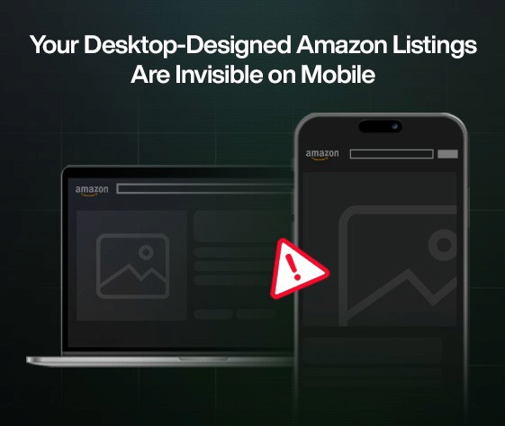
The numbers tell a sobering story for Amazon sellers.
Over 70% of Amazon traffic now comes from mobile devices.
Yet most brands continue designing listings as if shoppers are sitting at desks with 27-inch monitors.
The reality? Those carefully crafted desktop listings are breaking on mobile. Hero images get cropped. Bullet points collapse behind a "See more" button. A+ modules stack awkwardly, disrupting narrative flow.
And now, AI assistants like Rufus are starting to prioritize mobile-friendly content in recommendations. That creates a double disadvantage for brands still designing listings for desktop.
This isn’t just about aesthetics. When WorkinX analyzed conversion data across 1,500+ products, Amazon Listing Optimization efforts focused on mobile-first showed conversion lifts of 18–32% compared to desktop-designed counterparts.
As one major housewares brand discovered: what looks perfect in Seller Central preview often becomes a conversion nightmare on an iPhone.
The most effective Amazon Mobile Listing approaches prioritize an entirely different visual hierarchy:
Hero images with high contrast and zoom-friendly focal points that communicate the core product value at thumbnail size
Front-loaded product titles with critical who/what/why elements in the first 60 characters (before truncation)
Bullets that start with benefit statements, not feature specifications
A+ content that tells a sequential story as users scroll down, not across
Comparison charts redesigned for vertical scanning, not horizontal reading
Strategic white space that creates visual breaks for the eye
WorkinX testing shows that mobile-optimized product pages essentially function as conversion-focused landing pages, not information repositories.
The most successful approach: assume shoppers will see just 30% of your content and make sure that 30% carries 100% of your value proposition.
The future of Amazon shopping is decidedly mobile-centric, with several emerging trends poised to reward early adopters:
Amazon is investing heavily in mobile-exclusive features like shoppable videos, interactive 3D product views, and AI-guided shopping experiences through Rufus.
Augmented reality try-before-you-buy experiences are expanding beyond furniture into beauty, fashion, and electronics.
Voice shopping integration between Alexa and mobile visual experiences is creating hybrid shopping journeys that start verbally and finish visually.
Perhaps most importantly: Amazon's internal data shows that mobile conversion rates are still 15–20% lower than desktop, representing a massive opportunity for brands that solve the mobile experience challenge.
This isn't a minor channel adjustment, it's the difference between visibility and invisibility to 7 out of 10 potential customers.
For brands ready to capture this advantage, the message is clear: if your Amazon content strategy isn't mobile-first in 2025, it's barely a strategy at all.
Before you go back to designing your next set of listing images or briefing your A+ content, ask yourself this: are you building for the screen your customers are actually using?
Mobile isn’t the side dish anymore, it’s the whole plate. And if your content isn’t instantly understandable, swipe-stopping, and crystal-clear on a phone screen, you’re leaving visibility (and conversions) on the table.
The good news? You don’t need to rebuild everything. You just need to rethink the first 3 seconds. Because in mobile commerce, that’s where attention and revenue is won.
Now’s the time to zoom out, shrink your screen, and see what your customers really see. It’s also the time to lean into smarter A+ Content Optimization Amazon strategies that don’t just look good, they convert better where it matters most.